WOW.. I can't believe it has been almost a month since I have uploaded new lessons.. Thankfully Thanksgiving break is just around the corner, so I will have to to upload lots of lessons.
Be on the lookout!
Thanks for stopping by, please feel free to check out the lessons on this site, and please let me know (or link) me if you do decide to use one of them. I love seeing different kinds of outcomes..
:)
Monday, November 21, 2011

Tuesday, October 25, 2011
3rd/4th grade Fall Still Life
This week and next week the 3rd and 4th graders, will be drawing form observation. I set up a still life in the middle of the room. We talked about sketching, looking, view finders, observing, and not second guessing yourself. So far it has been a blast. I am so impressed with our drawing skills and imagination.
I encouraged the students to pick at least 2 objects to draw (mostly more than that) and then they could create their own background, such as, a wallpaper designs, outside design, a window, etc. These photos below are works in progress, to be finished next week!


I encouraged the students to pick at least 2 objects to draw (mostly more than that) and then they could create their own background, such as, a wallpaper designs, outside design, a window, etc. These photos below are works in progress, to be finished next week!


Tuesday, October 18, 2011
3rd grade Giraffes
Okay.. So I have done this project before, last year. This year I changed it up a little to make it less timely and to give the students more time to paint.
I have seen a lot of "animal portraits" on art education blogs, even some giraffe portraits. I will link up my last year post, because I believe it has some more details.
This year I had the students use oil pastels for the spots and background objects and then used watercolor techniques for the giraffe skin, sky, and grass!


I have seen a lot of "animal portraits" on art education blogs, even some giraffe portraits. I will link up my last year post, because I believe it has some more details.
This year I had the students use oil pastels for the spots and background objects and then used watercolor techniques for the giraffe skin, sky, and grass!

Don't you just love that tongue and character of this giraffe


Oh that nose! such character and creativity

Monday, October 10, 2011
4th grade Keith Haring Positive Negative Designs
We learned about Keith Haring. There is a great Keith Haring website to check out and show your students, www.haringkids.com.
Keith Haring was so original in thought and I wanted to come up with a project that would have the students thinking about different simple people designs as well as, focusing on positive and negative.
So we started with one color sheet 6" x 16" and two 6" x 4". They drw there designs with either pencils or white color pencils to make it clearer.
I showed them how to make "little" cuts an paste it down tightly so it looks like one piece and makes the viewer wonder how they cut it out so neatly and cleanly.
Check them out!


Keith Haring was so original in thought and I wanted to come up with a project that would have the students thinking about different simple people designs as well as, focusing on positive and negative.
So we started with one color sheet 6" x 16" and two 6" x 4". They drw there designs with either pencils or white color pencils to make it clearer.
I showed them how to make "little" cuts an paste it down tightly so it looks like one piece and makes the viewer wonder how they cut it out so neatly and cleanly.
Check them out!


WOW... so impressive!!
1st grade Mondrian Butterflies
This project is actually from last Spring. I don't believe I posted this before.
We studied artist Piet Mondrian. Focusing on lines, shapes, and of course the primary colors.
We started out with 12" x 18" white piece of paper. Holding it horizontally we added a "skinny" oval in the middle of the paper and made wings on each side.
We used rulers to create 4 horizontal lines and 4 vertical lines (diagonals were allowed) We used black oil pastel to draw.
We then added primary colors "randomly" to different shapes. Cut them out and either paste on to another paper (blue) or just keep cut out.
*Modify: You could have the students mix the primary colors into secondary colors, to work on mixing colors and painting neatly. So it would be influenced by Mondrian but have a new twist, with the primary colors.


We studied artist Piet Mondrian. Focusing on lines, shapes, and of course the primary colors.
We started out with 12" x 18" white piece of paper. Holding it horizontally we added a "skinny" oval in the middle of the paper and made wings on each side.
We used rulers to create 4 horizontal lines and 4 vertical lines (diagonals were allowed) We used black oil pastel to draw.
We then added primary colors "randomly" to different shapes. Cut them out and either paste on to another paper (blue) or just keep cut out.
*Modify: You could have the students mix the primary colors into secondary colors, to work on mixing colors and painting neatly. So it would be influenced by Mondrian but have a new twist, with the primary colors.


Sunday, September 18, 2011
4th Grade St. Basil's Cathedral Inspired Towers
A couple years ago I had the honor to go on a trip To Russia with my dear friend and her family.
We traveled from St. Petersburg to Moscow. In Moscow we visited the Red Square and Of course the famous St. Basil's Cathedral. I was in awe and couldn't believe how colorful and breathtaking it was!


We traveled from St. Petersburg to Moscow. In Moscow we visited the Red Square and Of course the famous St. Basil's Cathedral. I was in awe and couldn't believe how colorful and breathtaking it was!

So I always wanted to study this beautiful piece of Architecture.
We talked about the St. Basil's cathedral, terms, like onion dome, spire, arch, etc.
So the students used rulers to create straight lines for their towers, then created onion domes and spires and they were allowed to create their own "creative"towers, to show a more individual thought.
We talked about how to add textures in "clusters" to show that the towers were a texture but just a hint so it wouldn't look so cluttered.
AND of course, focused on bright and bold colors influenced by St. Basil's Cathedral!
Let's check them out.


I will update with other finished projects once completed this week! THey were allowed to experiment with a twist on the towers with more creative and modern tower designs.
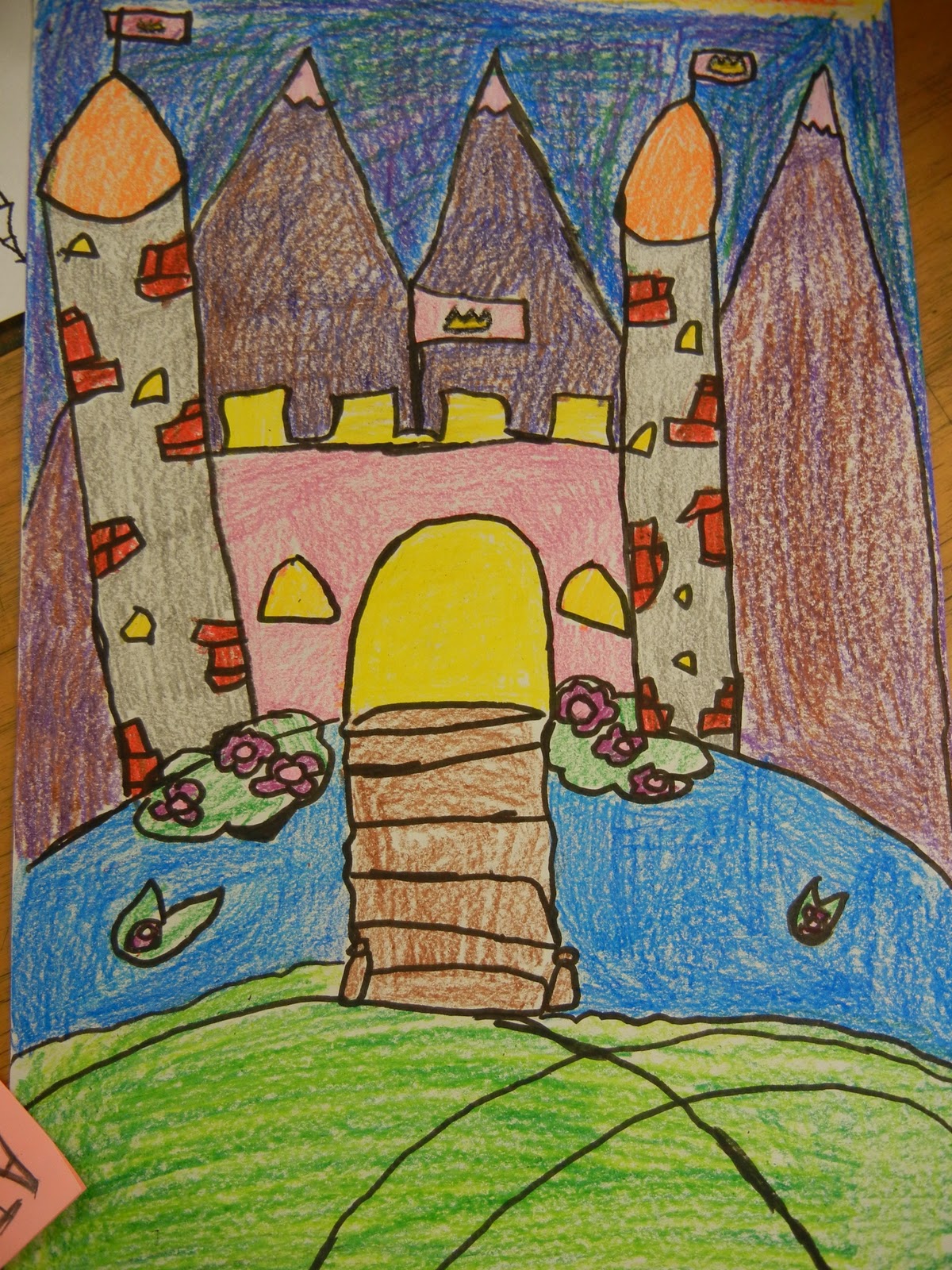
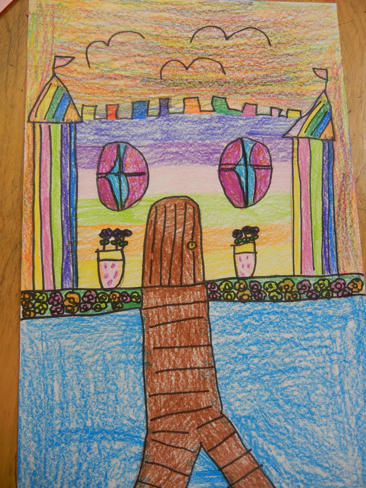
3rd Grade Castles
This project can be adapted to different grades.
We are studying a unit on "Architecture" for 3rd and 4th grade. I wanted to start out with something that would review using a ruler, our imagination and basic shapes.
I made a very quick power point showing different castles from around the world, had different castles terms defined, and then spoke about what we would be doing.
They used rulers to create straight lines, they were to draw their castle anyway they would like. I showed a brief demonstration on rulers, basic castle shapes, how to draw a drawbridge, etc. and then said add "your own flare/creativity". They had a texture sheet on how to add different textures such as, bricks, stones, polka dots, checkerboard, etc.
We used a 11" x 17" white constructions, drew in pencil line, outline with sharpie markers, and colored in with crayons or markers.
Check out these amazing castles! ( did see some cool castle design projects on Deepspacesparkle and ms.julie's art school)
I really wanted the students to feel like real building designers and architects!


We are studying a unit on "Architecture" for 3rd and 4th grade. I wanted to start out with something that would review using a ruler, our imagination and basic shapes.
I made a very quick power point showing different castles from around the world, had different castles terms defined, and then spoke about what we would be doing.
They used rulers to create straight lines, they were to draw their castle anyway they would like. I showed a brief demonstration on rulers, basic castle shapes, how to draw a drawbridge, etc. and then said add "your own flare/creativity". They had a texture sheet on how to add different textures such as, bricks, stones, polka dots, checkerboard, etc.
We used a 11" x 17" white constructions, drew in pencil line, outline with sharpie markers, and colored in with crayons or markers.
Check out these amazing castles! ( did see some cool castle design projects on Deepspacesparkle and ms.julie's art school)
I really wanted the students to feel like real building designers and architects!


Subscribe to:
Posts (Atom)